way finding.

“Wayfinding refers to information systems that guide people through a physical environment and enhance their understanding and experience of the space.”
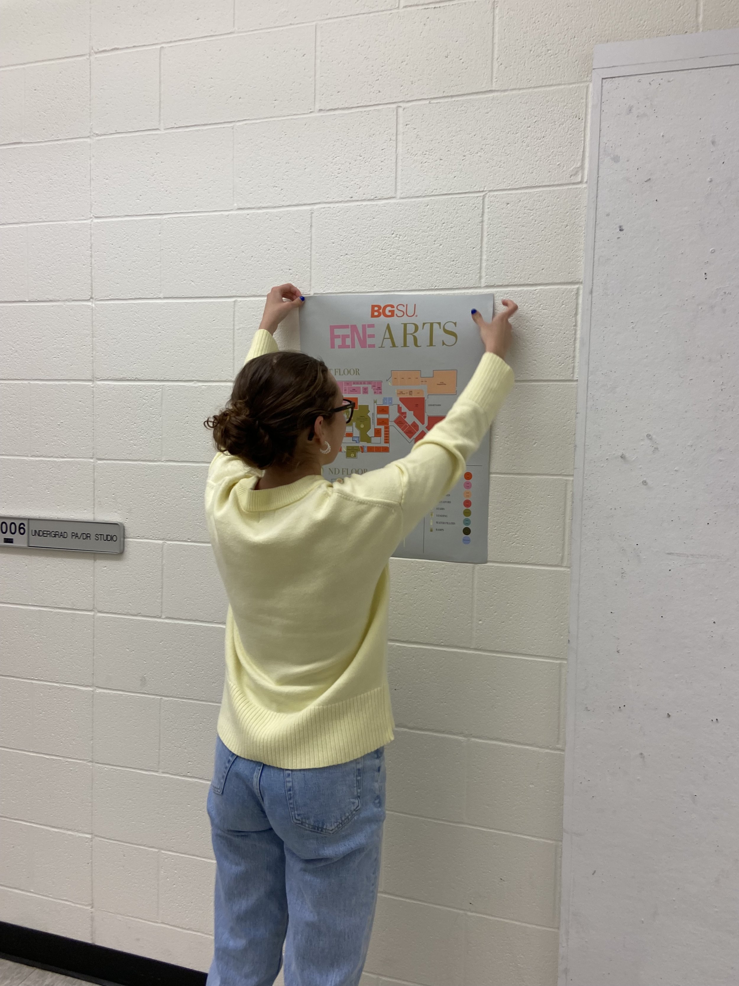
-Society for Experiential Graphic Design

We chose to make our concept for all of the parts of the project centered around “3D flat”. The iconography was designed to create unity among the mural and 3D flat concept. The yellow green color contrasts against the color coded map, but stays consistent to identify landmarks both on the map and on signage. By avoiding human figures for the restroom signs, we avoid gender stereotypes in regards to who is welcome in each restroom. Gender and accessibility concerns were incorporated into the execution.

Bright colors contrasted the sterile feeling of the art building and channeled the creativity of most art students a little bit more. We also incorporated BGSU’s orange and seafoam into our pallet. By doing so we created a design that reflected both the college and the students inside of the building. The hierarchy of the typography and variety of Bodoni and hand made fonts is a strong suit in all of the designs. Careful consideration of type size and readability as well as contrast in type weight makes for strong compositions.

Previous
Previous

Cycle Syncing . interactive ebook

Next
Next

OH! FLOCK . app concept